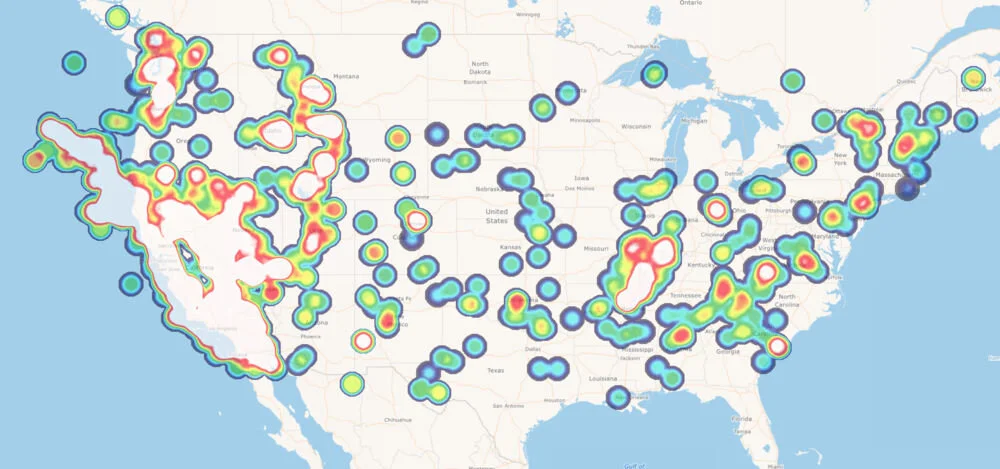
Visualize Your Data by using Heat Maps.
Do you have data that you would like to represent geographically? Let’s say you have sales data, customer locations, earth quake information or any data with unique values, you could use heat maps to get visual representation of your data. Heat maps can be used to show a concentration of points or distribution of attribute values.
Take advantage of the various Map Suite APIs to create custom maps including heat maps based on your specific requirement. For a visual sample review the Heat Style demo using Map Suite WebAPI Edition here.
Heat maps are visually appealing and they tell the story behind your data. Download the sample from GitHub to evaluate and start telling your story today! Numerous code samples are available to you allowing you to get started quickly.

